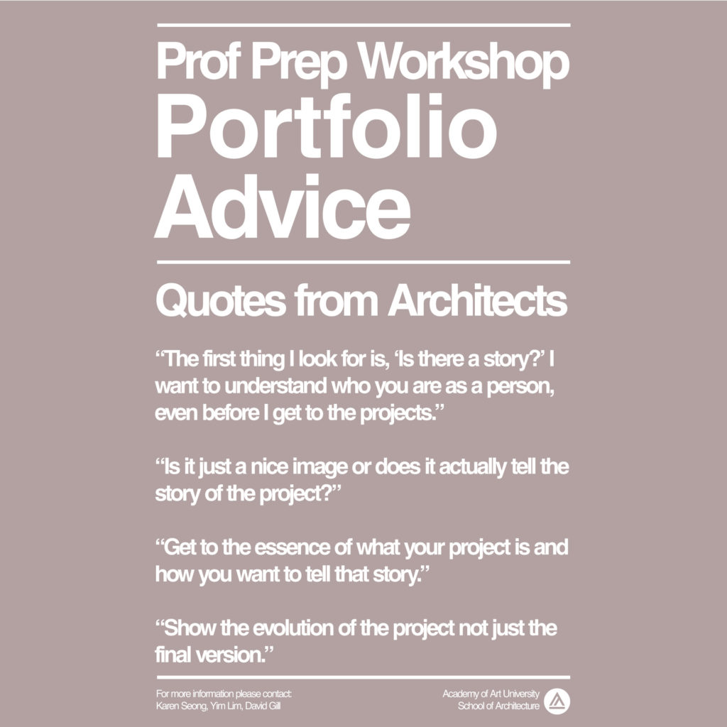
Advice given to students during the portfolio review sessions below. Recording are available here.
On Creating a First Impression with Your Portfolio:
“The first thing I note is actually not the work, but the way that the portfolio has been put together. Is there some type of visual hierarchy?”
“The first page is always the most critical because it’s the first impression you get. It should be really simple or it should tell us about your brand.”
“When we open up a portfolio and we see 40 pages we’re less likely to actually make it through all the way.”
“When we look at a resume and there’s a spelling error, that resume is tossed out.”
“It’s important to understand that what you’re sending over is going to be viewed on a screen.”
On Editing Your Portfolio:
“Just because you have it doesn’t mean you need to show it in your portfolio. And that’s the hardest part of editing a portfolio.”
“Is it just a nice image or does it actually tell the story of the project?”
“The ability to prioritize is a high value skill in a billable firm environment. As a student, your time isn’t billed per hour but in a firm you have to be conscientious about how long you spend on any given task. How you edit your portfolio indicates your ability to prioritize.”
“How you edit, how you manage white space are important aspects of the portfolio.”
“If it isn’t showing what it is meant to show, then it shouldn’t be in your portfolio.”
“Provocative images don’t hold value to me anymore when reviewing portfolios.”
On Portfolio Content:
“The first thing I look for is, ‘Is there a story?’ I want to understand who you are as a person, even before I get to the projects.”
“Get to the essence of what your project is and how you want to tell that story.”
“I’m looking for clarity of thinking. The portfolio is a venue for firms to understand how you think and how you work. That’s why it’s so important to have clarity.”
“Portfolio reviews happen in a very short amount of time. This means you have to very clearly guide the reviewer from the overall to the detail very quickly. Label every graphic very clearly.”
“Annotations below the drawings are really critical. Especially if they’re telling a part of the story. Place the annotation below the image. Then our eyes have already gone to the image and we’re more likely to read that text.”
“To answer the question, ‘Tell us about yourself,’ if you can answer through the first couple of pages of your portfolio, using your graphics, it’s just going to resonate that far.”
“My initial take looking at your portfolio is, ‘Please come in for an interview.’ This shows a range of skills and problem solving skills that are pretty amazing.”
“The simple vignettes and the models are so great because I can figure out your process, and how you developed the project, and what was important to you.”
“I love seeing sections and details. That’s usually what I look for. Many students have great renderings and diagrams. But great floor plans and details are not as commonly included in the portfolio.”
“Show the evolution of the project not just the final version.”
“During an interview, I always want to see how you developed the concept.”
“It’s okay to show something in the portfolio to showcase a skill.”
“Quick sketches that show the thinking sets you apart from other applicants. A lot of people can do renderings nowadays.”
“I have two criteria for portfolio reviews. One is checking the box on technical skills. The second is critical thinking skills that explain how you arrive at design proposals.”
“Architectural design is intentional design. We ask, ‘What is the intention of the designer? What value is the designer trying to carry out?'”
“Complexity without an explanation of its value should be avoided.”
“It is a good idea to include the resume in the portfolio so that the reviewer doesn’t need to look for it.”
To view an overview of the PPWS (Professional Preparedness Workshop) see this page.

